
1. 引言
网页中常见一些三角形,使用 CSS 直接画出来就可以,不必做成图片或者字体图标。
一张图, 你就知道 CSS 三角是怎么来的了, 做法如下:
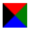
 div {
    width: 0;
    height: 0;
    border: 50px solid transparent;
    border-color: red green blue black;
    line-height:0;
    font-size: 0;
}- 我们用css 边框可以模拟三角效果
- 宽度高度为0
- 我们4个边框都要写, 只保留需要的边框颜色,其余的不能省略,都改为 transparent 透明就好了
- 为了照顾兼容性 低版本的浏览器,加上 font-size: 0; line-height: 0;
2. 使用
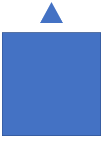
2.1. 效果图
2.2. 代码参考
<!DOCTYPE html>
<html lang="en">
<head>
    <meta charset="UTF-8">
    <meta name="viewport" content="width=device-width, initial-scale=1.0">
    <meta http-equiv="X-UA-Compatible" content="ie=edge">
    <title>CSS 三角制作</title>
    <style>
        .box1 {
            width: 0;
            height: 0;
            /* border: 10px solid pink; */
            border-top: 10px solid pink;
            border-right: 10px solid red;
            border-bottom: 10px solid blue;
            border-left: 10px solid green;
        }
        .box2 {
            width: 0;
            height: 0;
            border: 50px solid transparent;
            border-left-color: pink;
            margin: 100px auto;
        }
        .jd {
            position: relative;
            width: 120px;
            height: 249px;
            background-color: pink;
        }
        .jd span {
            position: absolute;
            right: 15px;
            top: -10px;
            width: 0;
            height: 0;
            /* 为了照顾兼容性 */
            line-height: 0;
            font-size: 0;
            border: 5px solid transparent;
            border-bottom-color: pink;
        }
    </style>
</head>
<body>
    <div class="box1"></div>
    <div class="box2"></div>
    <div class="jd">
        <span></span>
    </div>
</body>
</html>
Comments NOTHING